
Phantom & Son, Intl.
Consultation, Art Direction, Design and Illustration
Consultation, Art Direction, Design and Illustration
What we do is not magic—it’s only supernatural.
We do:
books and other kinds of publications,
stamps,
illustration,
packaging, and so on,
and we teach and write about design. This website shows some of our favorite projects (only a few). You can reach us by e-mail or through telepathy, but please e-mail first if you are planning on attempting the latter. Thank you.
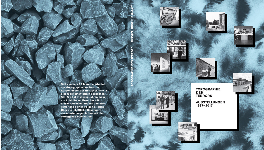
Book Cover for the 30 Year Anniversary Publication of the Topography of Terror (2017)
The Topography of Terror (Topographie des Terrors) is a Holocaust documentation center in Berlin, Germany, built on the premises of the former headquarters of (among others) the secret police apparatus of the “Third Reich”. It is a significant place of remembrance with more than 1 million visitors each year.
For the publication commemorating the Topography of Terror's 30th anniversary I was tasked with designing the cover (I am still so humbled by this). Part of my concept was to contrast straightforward photo documentation from the institution’s exhibition archive with an abstract embodiment of the historical period the institution is documenting — the past and the present as visual layers, one of turmoil and one of the attempt to learn from it and help others to learn from it. The back cover of the book shows rubble from the bombing of Berlin, a metaphorical bedrock for the book’s contents on the pages before, or, so to speak, of what was built on top of it, page by page (the book as topography).
For the publication commemorating the Topography of Terror's 30th anniversary I was tasked with designing the cover (I am still so humbled by this). Part of my concept was to contrast straightforward photo documentation from the institution’s exhibition archive with an abstract embodiment of the historical period the institution is documenting — the past and the present as visual layers, one of turmoil and one of the attempt to learn from it and help others to learn from it. The back cover of the book shows rubble from the bombing of Berlin, a metaphorical bedrock for the book’s contents on the pages before, or, so to speak, of what was built on top of it, page by page (the book as topography).

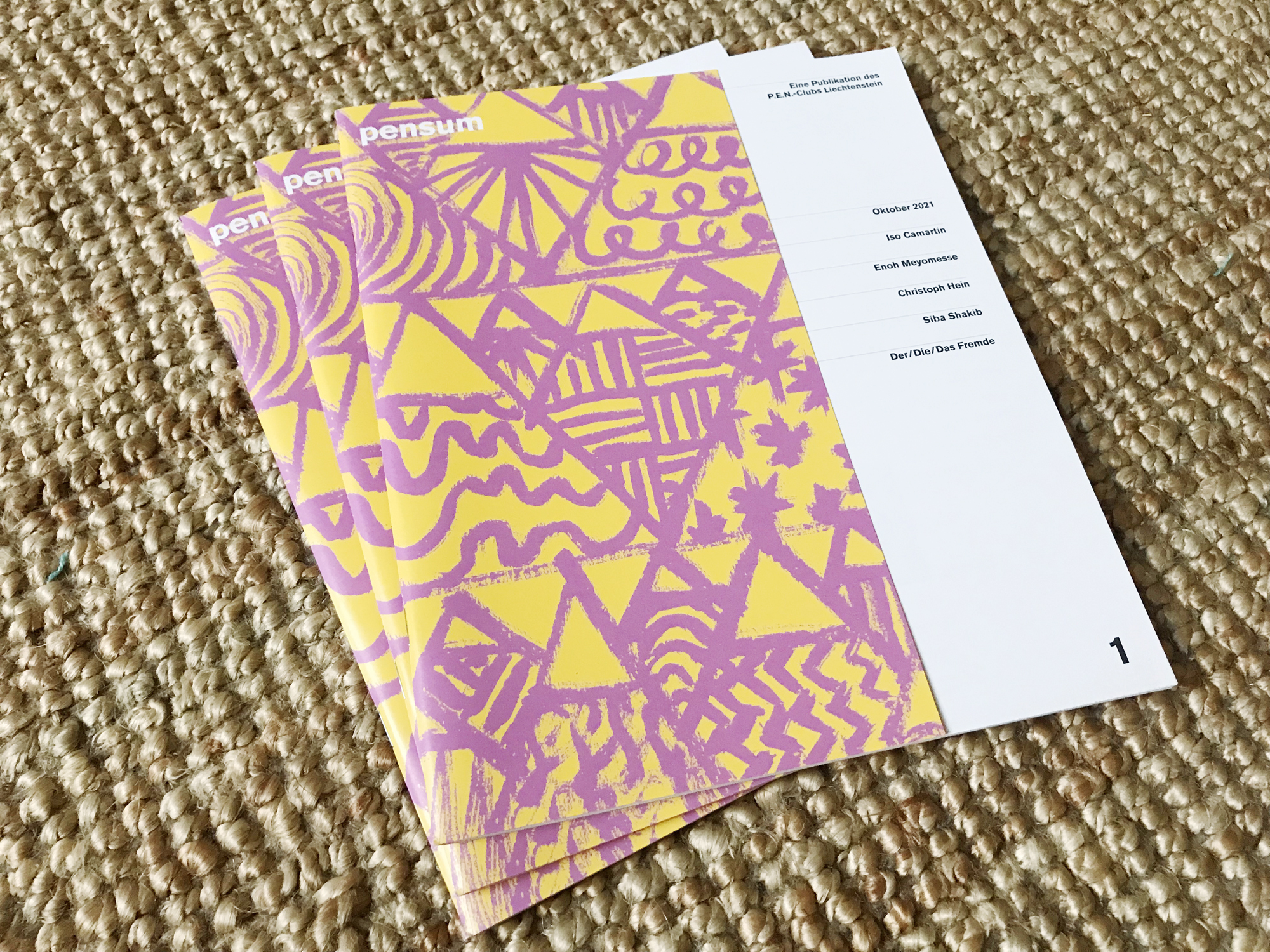
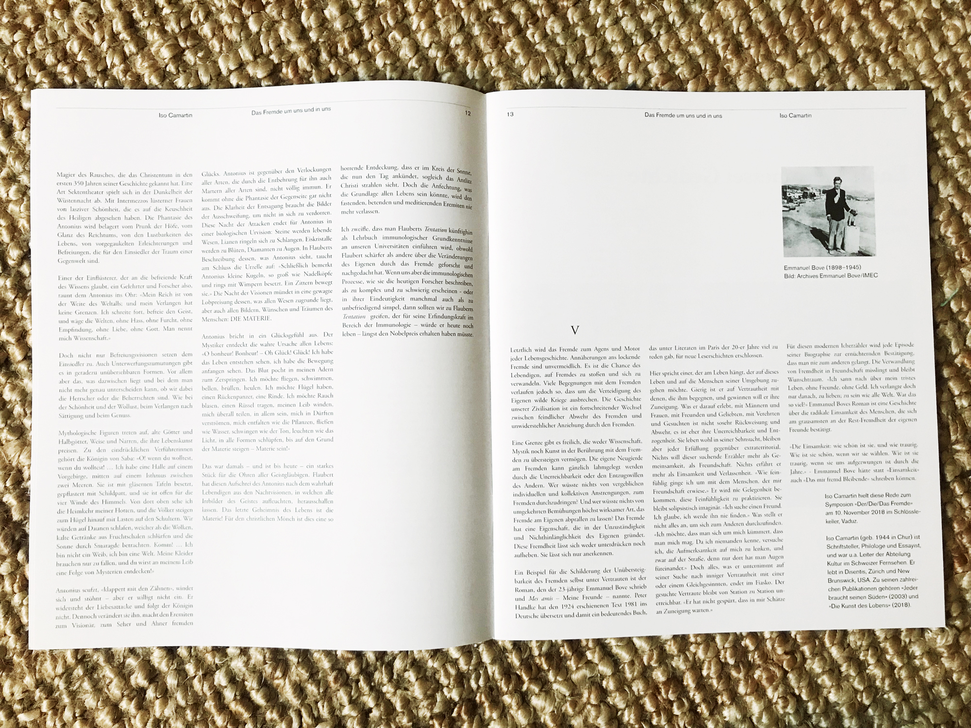
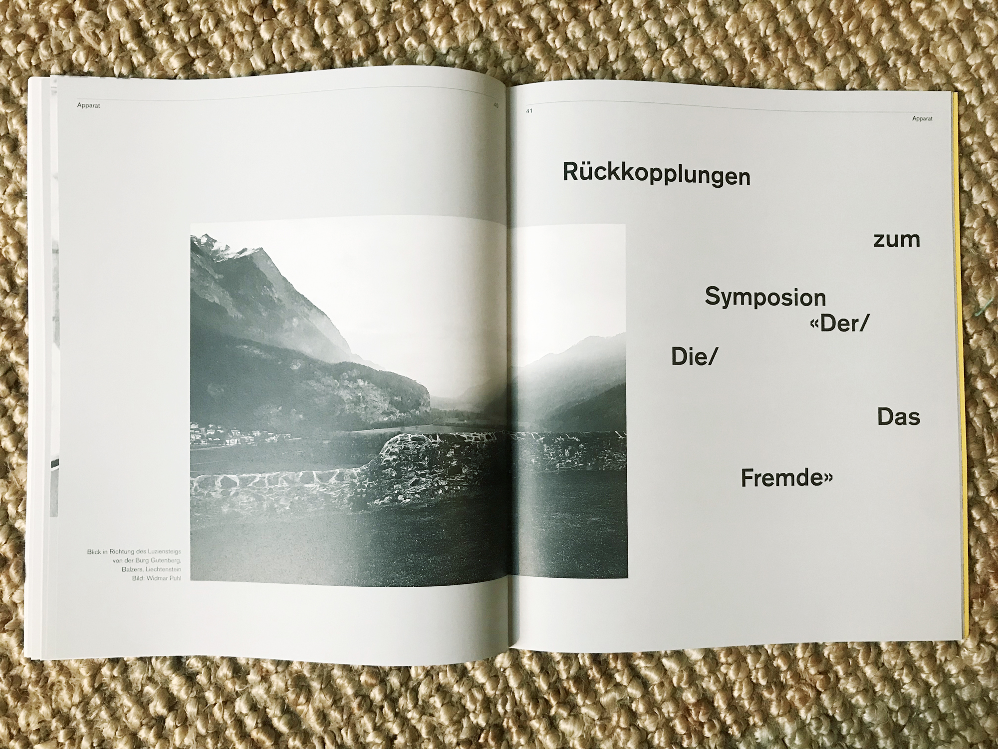
Publication Design for pensum (2021)
pensum is a literary magazine published by the P.E.N.-Club Liechtenstein. Pictured here is the first issue with its cover and two interior spreads.
When I was commissioned to art direct this project I was given one main directive: visibility. I took that literally by creating a cover flap that reveals part of the table of contents from the following page. The part that is instantly visible is the list of names of the writers whose contributions’ titles (and page numbers and departments) are then revealed upon opening the magazine. This design decision is an attempt at allowing the reader to enter the content of the magazine before having turned a page.
When I was commissioned to art direct this project I was given one main directive: visibility. I took that literally by creating a cover flap that reveals part of the table of contents from the following page. The part that is instantly visible is the list of names of the writers whose contributions’ titles (and page numbers and departments) are then revealed upon opening the magazine. This design decision is an attempt at allowing the reader to enter the content of the magazine before having turned a page.
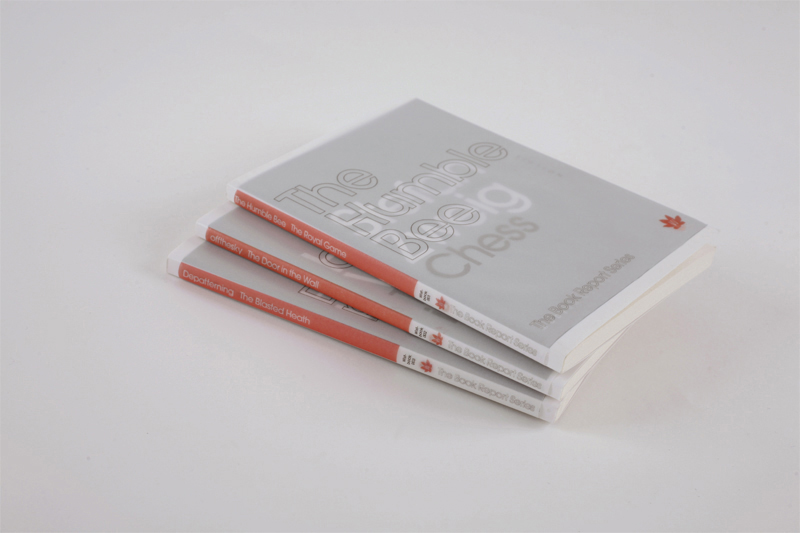
Cover Sleeves for the Book Report Series by Wist Rec (11 volumes, 2011–13)
For this project, the music label Wist Rec commissioned artists to create new soundtracks to existing books. The soundtracks were then attached inside of the book in the mini CD format. The books were already published before, used in an appropriated way for this edition series.
My task was to create covers for these books that would not only announce the new music part, but also somehow keep visible the fact that this was an existing book with a title and a writer — and a publisher. After some tests with materials and processes it became clear that glassine would work as the material for the cover sleeves. I layered the name of the musician or band for each volume on top of the name of each respective writer, and I adapted my design to the existing design to cover up and yet reveal at the same time all the original information that would be underneath it, including the book publisher’s logo that was overlaid by the logo of Wist Rec. I handmade all the hundreds of covers needed for the edition in my studio, including the printing and cutting, before I shipped them to the label where they were — again, manually — wrapped around every single book.
“… innovative, medium-spanning releases, which [combine] classic short stories with newly composed soundtracks.”
—Exclaim Magazine
“… neatly constructed, consisting of a simple translucent cover … with the artist’s name overlaying that of the author while leaving both perfectly legible.”
—ATTN: Magazine


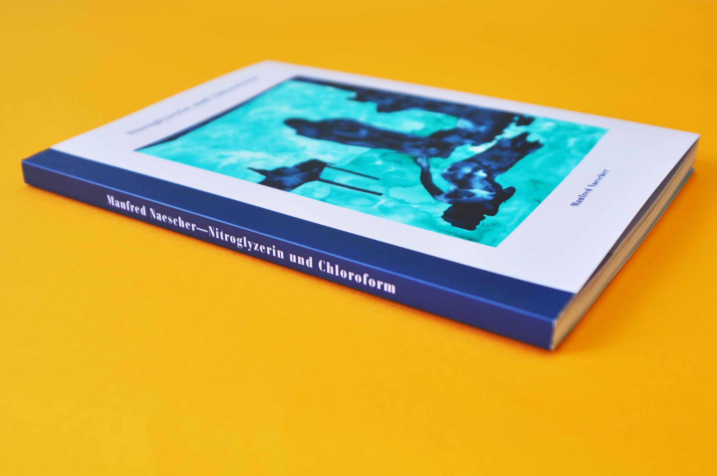
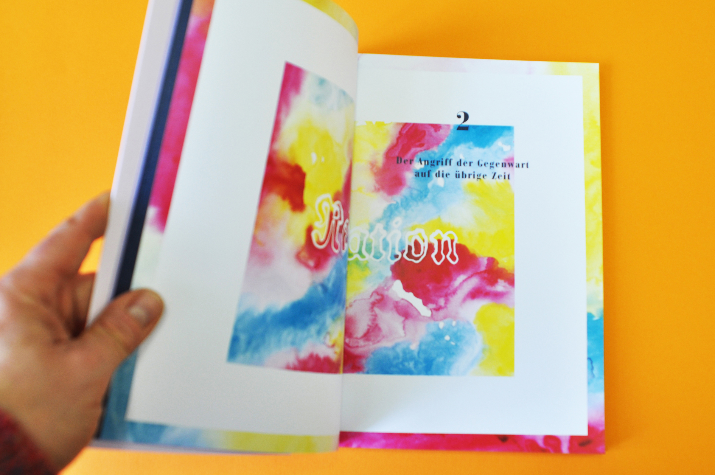
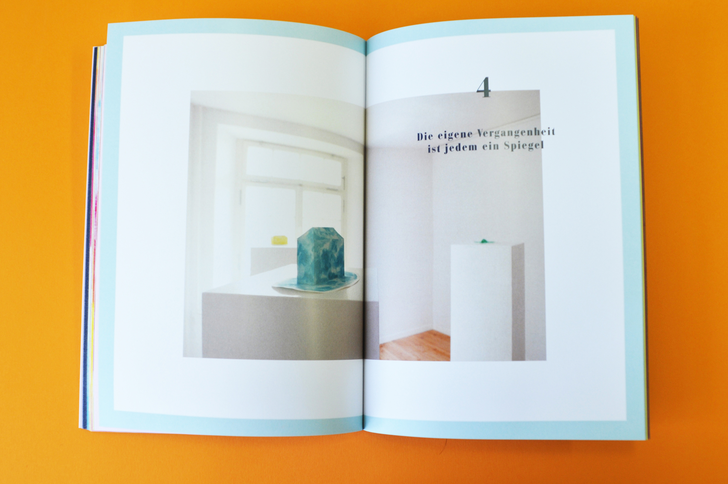
Book Design for Nitroglyzerin und Chloroform by Manfred Naescher (2015)
This book accompanied an exhibition by Manfred Naescher in tribute to the historian and early proponent of European democracy, Peter Kaiser (1793–1864). It contains imagery based on his life and work and it is something between a catalog and an artist book, as it reconfigures and recontextualizes the material of the exhibition in its page layouts. Slipped into the back flap is a 16 page text insert. The book was limited to 40 signed and numbered copies, a limited art edition in publication form.

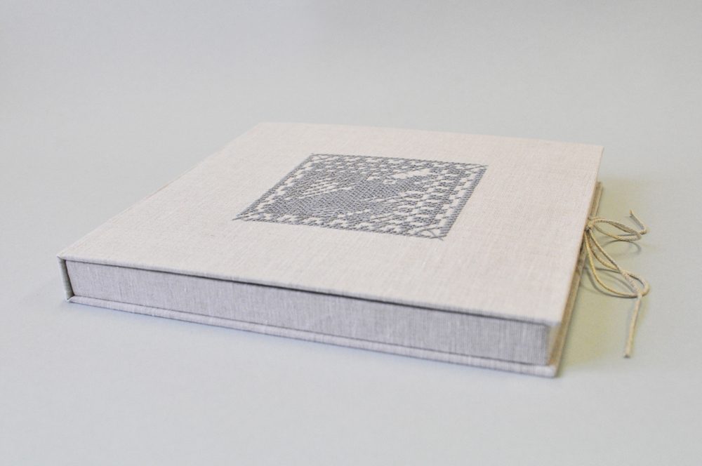
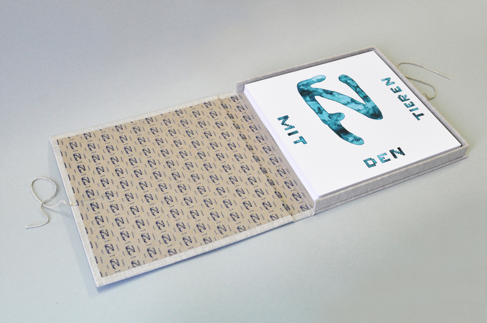
Book Box for the Portfolio Edition Ferdinand Nigg mit den Tieren [Ferdinand Nigg with the Animals] by Manfred Naescher (2015)
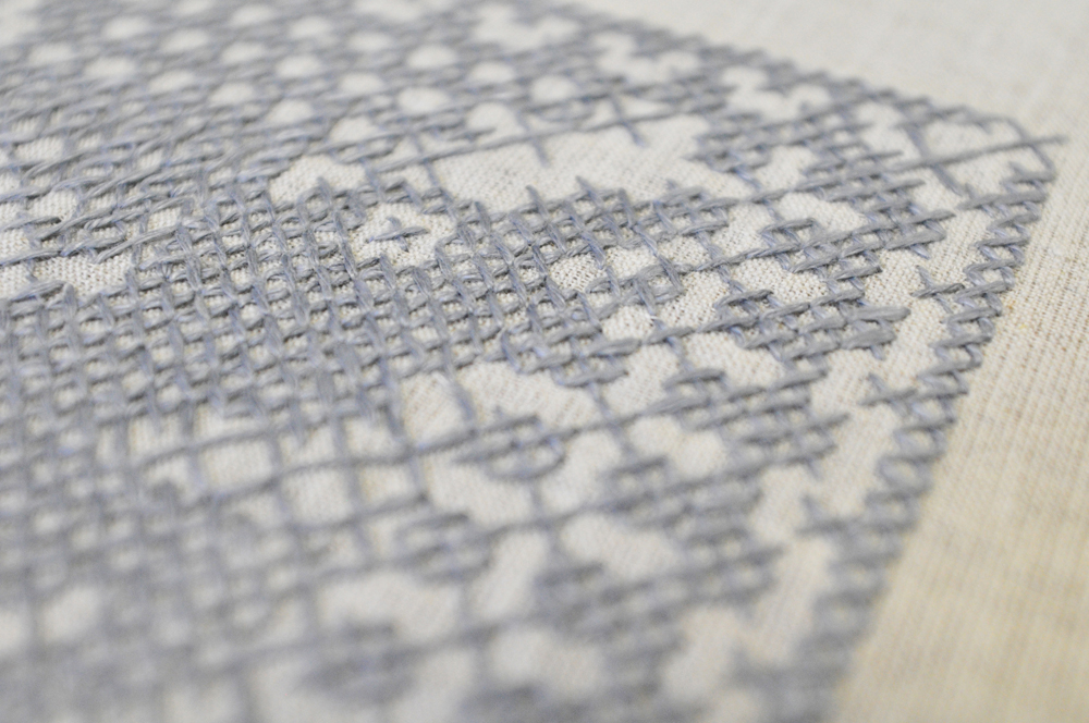
We love collaborating and this project offered a great opportunity to work with skilled people from multiple disciplines. Made in tribute to the textile artist Ferdinand Nigg (1865–1949), we were lucky to be able to have the textile artist Amanda Fowler contribute original cross stitch work directly onto the linen for the book box covers. She created imagery in reference to Nigg’s animal motifs that were the basis for the drawings by Manfred Naescher for which the project was made.
The book boxes were devised, prototyped and built by the bookbinder Leah Buckareff. The images for the edition were photographed by Pedro Malacas. Apart from the printing of the 35 loose pages in the box, everything was made by hand in Berlin. We used two printers for this, Colorama for the Riso-printing of the text pages and end papers, and Heenemann for the digital printing on their HP Indigo printer. We made this in an edition of seven plus three artist proofs, each with a unique embroidery on the cover.
The book boxes were devised, prototyped and built by the bookbinder Leah Buckareff. The images for the edition were photographed by Pedro Malacas. Apart from the printing of the 35 loose pages in the box, everything was made by hand in Berlin. We used two printers for this, Colorama for the Riso-printing of the text pages and end papers, and Heenemann for the digital printing on their HP Indigo printer. We made this in an edition of seven plus three artist proofs, each with a unique embroidery on the cover.

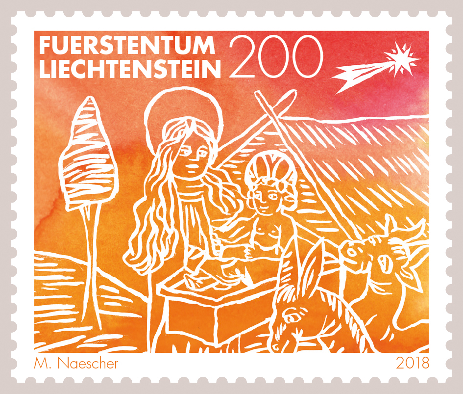
Christmas Stamp Series for Liechtenstein Philately (2018)
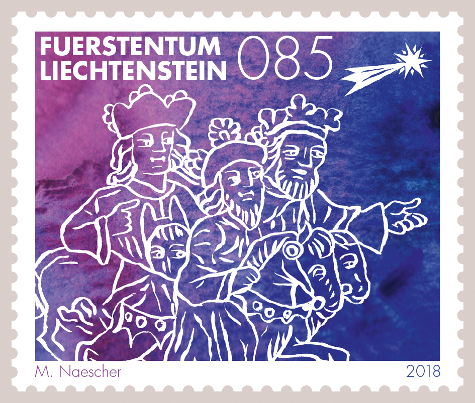
This project combined three of our favorite things: design, illustration, and storytelling. In the Christian Christmas story the three kings follow the star of Bethlehem — a shining light in the sky — to find their way to baby Jesus. So I decided to use light as a guiding principle for this four-part Christmas stamp series. The three kings and all the other protagonists and props of the story are depicted as white outlines, permeated by light, against a background that references the spectrum of light — the colors of the rainbow. It is a visual narrative from cool to warm colors on the color spectrum. Made with brushes, watercolor, Photoshop and InDesign.
The basis for the line drawings used for these stamps are woodcuts that were the first images of the three kings to be printed in a book, in the year 1480, in the “Historia Trium Regum” (The History of the Three Kings) by John of Hildesheim. I worked from a 1963 paperback version of the book, that, as a side note, was designed by the inimitable Celestino Piatti.
John of Hildesheim’s book was first published in 1364 (its authorship, however, is disputed). It is not a work of history, but a fascinating kind of imagining, or justification, commissioned by the church, of the biblical three kings, including their lives before and after their popular Christmas adventure. John of Hildesheim’s narrative caught people's imagination (with the help of dogma) and has done so for centuries. But even before John of Hildesheim wrote his account of the three kings, the story had been shifting shape for hundreds of years already, starting in the 4th century: At times there were six kings, at other times they were not kings but magicians, and only one of the four evangelists, Matthew, tells of these characters in the bible, the other three have no account of them. This, among other things, illustrates how all stories, and all histories, too, are in flux. And how storytelling is such a powerful human activity, an unstoppable force, with its aims and mechanics often, maybe too often, shielded from any critical examination.

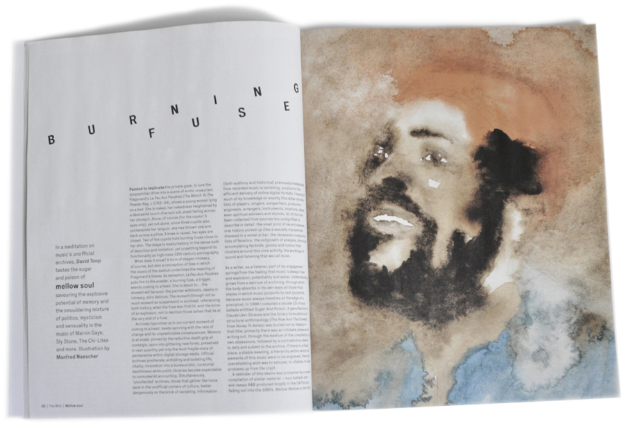
Portrait Illustration of Marvin Gaye for The Wire Magazine (2011)
The Wire is our favorite music magazine, so it was a special treat to be asked to contribute an illustration to a feature article by David Toop on soul music. The brief was to create a portrait of Marvin Gaye that would convey notions of movement and time, of weaving in and out of space. I made 15 versions of this drawing (the one used was number 15), as I worked (again) in watercolor and therefore wasn’t able to edit aspects of the picture with a few clicks as would be possible in a digital illustration.
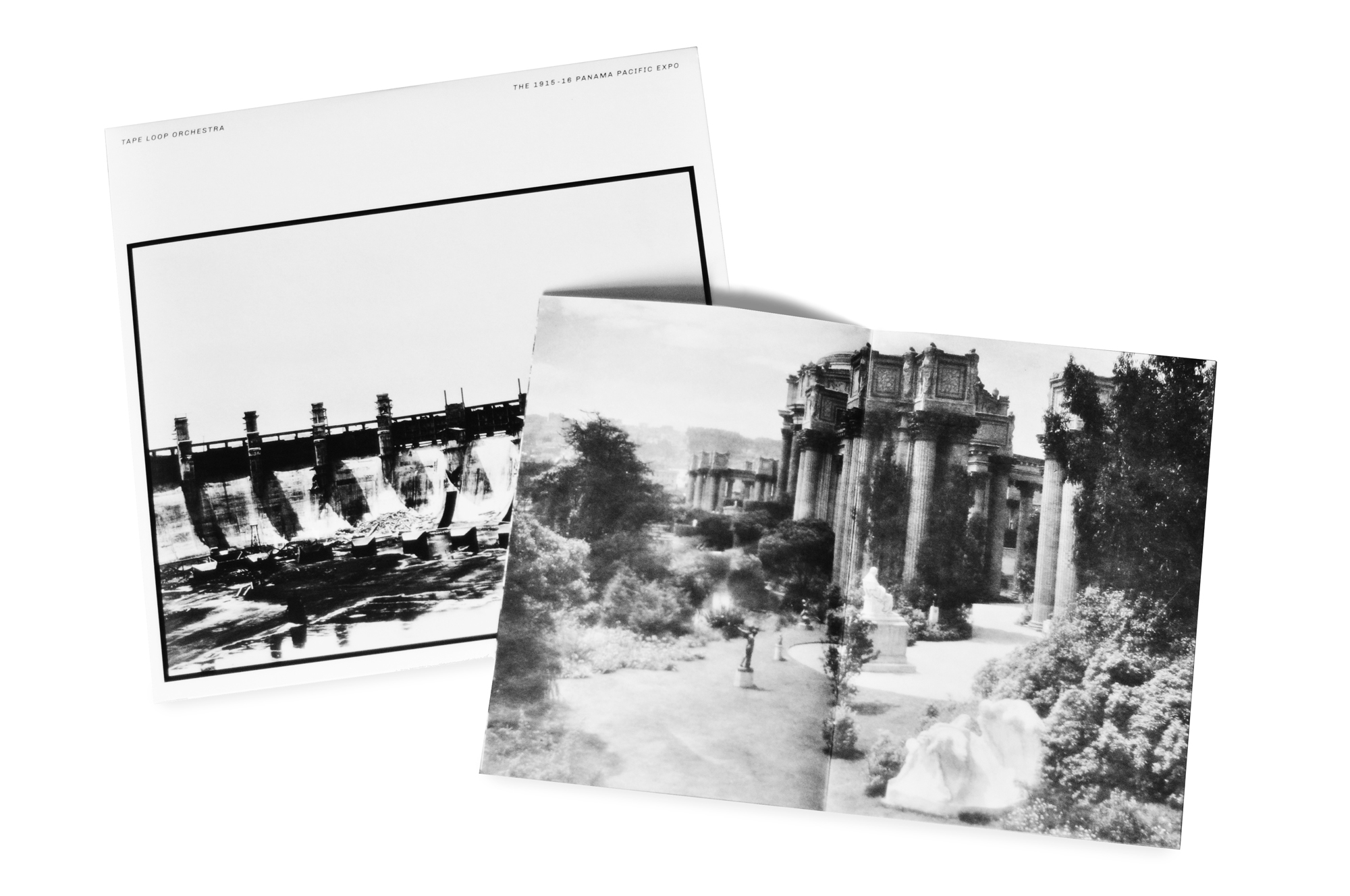
Album Cover and Booklet for The 1915–16 Panama Pacific Expo by Tape Loop Orchestra (Wist Rec, 2017)
Lots to say about this and all my other work for Wist Rec, but not today. There is an essay in the works for all that and I will share that with anyone interested when it’s ready. I will also update this website with some of the more experimental work I did for Wist Rec when the time is right. For now just this: Working with Gary Mentanko at Wist Rec was an incomparable experience for me that I deeply cherish. It has left a mark in me and in a lot of the work I do. I was able to experiment, to go far out on all kinds of crazy limbs, to make all sorts of discoveries. I learnt so much. Thank you, Gary.

CD Sleeve for The Waning Branches EP by Porya Hatami (Wist Rec, 2013)


